Wednesday, 4 May 2016

In Umbra Res


Paul Graham: In Umbra Res


A photographer I have always been familiar with and interested in is Paul Graham. When researching photo books a good photo book which I thought me be a good example to look at was that of , 'In Umbra Res' by Paul Graham.

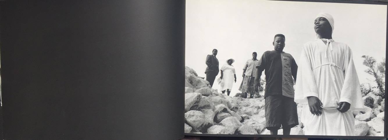
The photo book presents his documentary style images taken in Northern Ireland. The book is only made up of 16 images, which does seem like quite a neat amount however I expect the number of images in my own book to be slightly bigger. This series of images by Paul Graham, similarly to my own, focus' most upon people. 

I found a visual recording of the book In Umbra Res, on vimeo. 


The layout of this book is extremely interesting as Paul Graham shows elements of experimentation when presenting the images. The other photo books I have looked at up to now, present the images often the same size, and the only experimentation I have really seen is the placement of them, in terms of, some pages have 2 images across a double spread while others have only one image then one blank page across a double spread.

In Paul Grahams book he experiments with the layout of images in that sometimes there will be only one small image on a double page spread, while at other times there will be one image stretching across the double spread of pages, and even on one page there is 3 small square images side by side. 


Obviously depending upon the type of image or what the image is trying to say or what kind of impact the image is meant to have decides upon how large or small Paul Graham presents his images. Although large images often give a big impact when turning a page to see a large bold images before you, I also really like the use of space Paul Graham uses around some of his images. If anything, I feel the use of space makes the viewer focus upon the image in question even more so. 


As I've shown in previous posts, the two maquette books I have made so far were portrait. What really struck me when looking through this book besides the cleverly presented images, was the fact that the book was portrait. I noticed that the vast majority of Paul Graham's work are portrait images. At this point of realisation, I decided my next step in my own project should be to attempt to create a landscape book, to cater my images more suitably, as all of my own images are landscape.


I really think this concept works well where the placement of the images flow over onto another page. The viewers eye is drawn across the page as appose to just looking straight on at a single page. I would be intrigued to see what I could do with experimenting with this kind of layout in my own book. 


Suburbia Bill Owens


Photobook Research:

Suburbia by Bill Owens


Once again, I am looking at another photo book and paying particular attention to the layout of the first few pages in the book in order to see how another photographer chooses to create an introduction  before leading into the main body of the book with the images.


I really like this experimentation of using a bold colour as the paper which starts off the book connecting the hardback cover to the book itself. I also seen this kind of experimentation in an Ian Macdonald book where he used a bright red first page in contrast with the black and white book. This is something I may have to consider when creating my own book. My thoughts for the cover of the book as of now are plain black.


In most of the photo books I have looked at the books start with a blank page such as this or a page with the title on. 


I really like this use of images so early on in the book, before even getting to the main body of the book. The use of an image at the beginning of the book along with the title helps to set the scene for what the rest of the book is going to be about. The layout in this book reminds me of the layout of Martin Parr's book, Home and Abroad.


I definitely like the idea of placing an image next to the introduction writing, to again help set the scene and give an indiction to what the book is about or what style of images can be expected to be seen throughout the book. The use of an image next to the introductory writing can also be used to help support the wiring. 


The layout of the book appears to follow the similar layout I have seen occur in several photo books. With the images being placed to the right and often blank space being to the right. I really like this layout and find the space works really well surrounding the image.

The book also includes small captions below the images on each page helping to give abit more explanation and context to the image. This is something I have considered doing throughout my own book.


Tuesday, 3 May 2016

A time not here


Photobooks


After deciding to use colour images to carry on through my project. I now need to focus upon the making of my book. Although I have made two small maquette books, they were only mocks ups more so to get an idea of how the images would flow in the form of a book and to get an idea as to whether they flowed better as colour or as black and white. 

Now I need to look at photo books made by other photographers in order to help me decide on what size, shape or layout I want my book to be. There is a lot I need to consider when making a book in terms of colours of the actual book and whether to use writing in the book, as well as how and where to place the writing. 


This is a book I found called "A time not here" a book which presents the documentary photography of "the black life on the Mississippi delta". What caught my eye about this particular book was that the layout of the book was very similar to what I was attempting in my first maquette books, however this book was landscape, not portrait like my own books, which seems to work a lot better. 


Something which I find really interesting is this experimentation with the use of black pages as appose to the stand white pages we normally expect to find in a book. This is obviously intentional to link in with what the the images them selves are about. 


I really like the way the images fill the pages of the book. leaving no blank space other than when an image is purposely placed on its own. 


With my own images being landscape themselves, this layout would work really well. Howver I need to experiment with whether my images look best filling each page or having some space surrounding them. 


Something I have considered doing is placing writing either at the beginning of my book or on each page to try and give a better explanation as to what it is I am documenting as I worry my images do not explain enough for themselves what Sedgefield Ball game actually is. Because it is such a unique event I worry that people viewing  the images may not understand what it is that I am documentinhg. Where as for me, this book seem pretty straight forward in understanding what the subject matter is. I think this book is correct in not placing any writing among the images to explain them as they seem to explain themselves. 


Monday, 2 May 2016

Subjective / Objective photography


Subjective or Objective

When struggling with whether to use my images from Sedgefield Ball game in the original form as colour or the edited black and white versions there are many aspects I need to consider.

As I expressed in previous research, when looking at my images in both colour and black and white, I felt I much preferred the black and white images as they stood out more and look far more powerful one being turned into black and white and after I had experimented with making the contrast more intense. However I understand there has to be more reasoning behind my choice of black and white or colour other than just 'because I like the look of the images'. 


When turning the images into black and white I have came to realise I have to ask myself why did I do this. I have been beginning to imagine having these images in a portfolio and taking them for a job interview or if I were to use them to get a portfolio review. One question I may be asked is, 'Why are the images black and white.' I normally work in colour so using black and white would be quite a different approach for me to use. 

As I also previously discussed, When I look at the images in black and white they appear to have a completely different mood and feel toward them. I feel the images that work best in black and white are the images where you can see the game being played, where the men are chasing the ball and fighting. The images definitely have a more dramatic feel toward them and especially the ones of the  people watching the game such as the ones of the old man in the hat and the children, definitely feel more light hearted in colour as appose to black and white. 

When I was lucky enough to receive a portfolio review from Matt Finn the documentary photographer, I showed him some prints of my black and white images. I did not show any coloured images as I was intrigued to see what his opinion of the black and white images were.
His comments where that they reminded him of Northern Ireland style documentary photography and especially the pictures of the men, had a 'rough and ready' feel to them as well as giving the impression of aggression. 

This is intact why I must think deeper into whether I use colour or black and white and what my reasonings behind it is. When thinking about whether I want to be subjective or objective towards the documentation of this event, I want to give an honest portrayal of the days events, I simply captured everything that was going on around me this day and when I hopefully produce a book from this work, I want it to simply show a real and honest portrayal of Sedgefield ball game as I experienced it.


Not at any point was I drawn to any particular aspects or chose to photograph certain aspects of the day more than others. When showing my images to outside viewers I do not want to try and give an opinion across or certain feel with my images as I just want the documentation to be honest and something other people can't interpret themselves.

A subjective approach to photography would mean I was trying to give a particular opinion with the use of my work or make people feel in a certain way when looking at the images. I feel the use of black and white definitely does this as the images have a more mellow and serious feel toward them. Although the game is a rough and dangerous game, I still didn't want to try and strongly portray this through my photography, as I wanted to capture the celebration side of the days events too.

Capturing the images in colour means my work comes across as more of an objective approach as the images appear exactly how the viewer them selves would have seen these scenes if they too were there in the moment. Because I have established I want to give an honest approach of the documentation of the day I have come to the decision to keep the images in their natural form as coloured images. 


Sunday, 1 May 2016

Martin Parr photobook


Martin Parr; Home and Abroad


Because Martin Parr's work has been such a great influence to me during this project, I felt it was definitely necessary to look at a photo book by him. Parr has made numerous photo books so I felt looking at one of his books should be great inspiration as he is very experienced in this field. I've looked at many books during my research, but when I was looking for inspiration from these books, I was focusing heavily upon the placement of images in the main body of the book. Now I had finalised the layout of my images, like I mentioned in a previous post, I had the more final touches to make such as the placement of text. The beginning of a book is very important and I have come to notice that over the months I have been researching books this project. 

If one takes notice of a book, The book rarely will start as soon as you open it. There are often series of blank pages, title pages, acknowledgments and pages of text ect before getting to the main images. I noticed that in Parr's book and several other photo books that there is often a page to the left with an image on, then writing to the right, with either the introduction written on or the title of the book. I really like this layout here in 'Home and Abroad' and think the use of the image to the left hand side really does set off the double page. 


Quite similarly to my own ideas for my book, Parr focus' upon placing images on the right hand side of a double page. Obviously there shouldn't have to be any standardisation of how images should be laid out in a book, however I have come to learn that in photo books, this style of layout is a common occurrence. 


Parr often address social issues or tries to say more with his photography than just it being a simple documentation of everyday life. Whats interesting about this book is the way you can evidently see he has purposely placed certain images side by side with each other. He has very obviously not just placed these images side by side because they 'look good' or look balanced across the double page. However he has placed these images liked this in order to try and say something deeper. 


For example the bottom image, you can see one image is mothers with children in prams while the other is a mother with her child in a shopping trolly. He creates a comparison with the placement of the two images, leading the viewer to look between the two images and question what is is he is trying to say. I personally feel like the comparison being created is on one page what we would class normal 'typical' mothers to look and act like then the comparison is the fact maybe that caring sense of motherhood is slightly lost in the fast paced society we currently live in when it comes to shopping and buying material goods or the fact todays society is so based around consumerism we forget what actually matters and let our standards drop when it comes to things such as parenting. 


Saturday, 30 April 2016

machquette


Making a maquette book


In my minor project where I photographed Durham Miners Gala, as the end result in the way I chose to present my work I chose to create a maquette book. This was a A5 size paper back book which I hand made through saddle stitching the pages together and printing the pages myself. I made this book as a mock up version ready for when can progress onto making my own professionally printed book. 


As I began to discuss in a previous post in which I looked at a book which was produced by the documentary photographer 'Mark Power', my aim for my final project will be similar to my minor, In that I will produce a visual book as one outcome. 


Once I had converted my images into black and white, I was very undecided on whether I should use my original coloured images, or use the converted black and white images.


As I also had to concentrate on narrowing down my images and choosing a selection to create a book. I chose to create a mock up book of a coloured version and a black and white version. 


I chose to work with A5 sized portrait style books to begin with. During a tutorial with my tutor I was shown a small maquette around this size in black and white. The way the images had been laid out was two images side by side on a double page. I really liked this layout and thought it worked well. The images used in this maquette were also shot in landscape like my own images so I decided to attempt this layout myself, however I experimented slightly with the layout as I placed some images in different positions on the page and some sanding alone. The inspiration to create this layout was from a Paul Graham book. 


Own work


I then made a colour version of the book so I could compare the two. I made the colour book the exact same shape and size, as well as sticking to a very similar order with the images. I found when using colour some images worked better than they had in black and white therefore meaning I found I had more images I needed to include in my colour maquette. 


After making both maquettes one thing I had gained was a better idea of the order I actually wanted the images to be placed in. I still didn't feel completely sure on the layout of the images on each page or whether I wanted to use black and white images. However getting a final idea on the order of the images was something which was really important as I didn't want the images placed in an order where they there was no thought put into it. I wanted to make sure the images, if anything, where in chronological order to a certain extent so that they would make sense in telling a story to someone who may know nothing about this day. 

To help me decide on whether to use black and white or colour images before moving forward to making more mock up versions of my book I presented the two books to my peers in a group critique in order to gain some feed back. The feedback I gained that almost everyone preferred my images in colour. 

This feedback led me think about my what my aims were with the work originally. My original intentions were to capture not only the event its self but the community of Sedgefield on this day and the parts of the day such as the celebration and drinking which is a side no photographers ever seem to capture. This therefore along side my feedback from my peers helped me to decide on using colour. Photographing the happy spirits and community wouldn't be as affective in black and white. The positive response from my peers over my coloured images also re-stored my confidence in my original images. 


Friday, 29 April 2016

Black and White


Changing Images to black and white


After looking at the work by Stephen Curry in which he photographed the Sedgefield Ball Game over around 10 years in black and white, I was inspired to see what my own images would look like in black and white. On the day I shot these images the sky was very grey and it was quite a cold and bleak day, As it was after all the beginning of February. I felt the colours in the images weren't as vibrant as they could of been because of this and the sky in many of the images was bleached out, which I wasn't awful keen on. This therefore encouraged me more so to want to try my images in black and white. 


I chose to use Adobe lightroom to edit my images. When changing the images to black and white I found I could experiment more with making the images more contrasted and dramatic. 


To look at, I honestly feel as though I prefer my images once converted into black and white. The feel to images is completely different. The images look more defined, dramatic and powerful. The use of black and white eliminates the trouble I was having over thinking some of my images looked very washed out due to the grey bleak sky that was experienced that day. Although I prefer the look of the images in black and white, I have to think about the deeper meaning the use of black and white portrays. As the images were originally taken in colour I am still quite reluctant to use images which have been converted from colour to black and white.