Sunday, 12 January 2014

Evaluation


Self Evaluation


Introduction to Studio


The Studio Portrait


The photographer I chose to begin my research with was Thomas Ruff, a photographer who captures images in the style of passport photographs. I continued to research photographers whose studio portraits simply caught my eye.
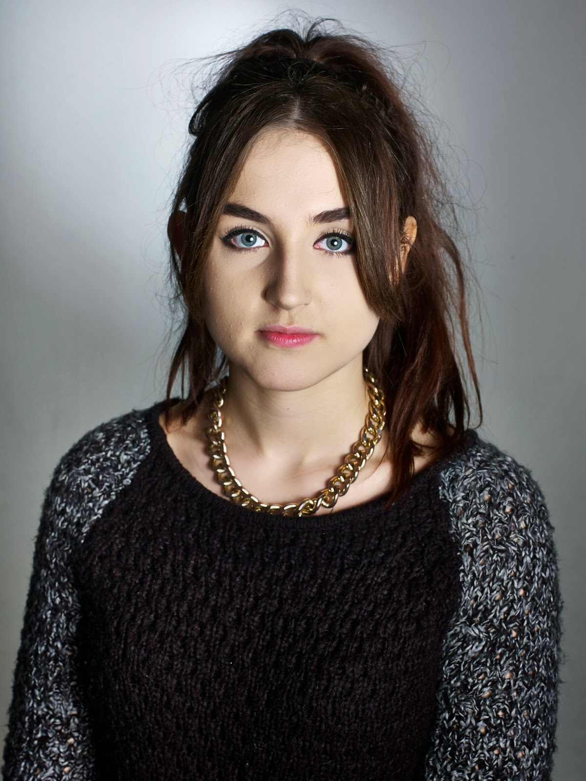
After a one to one with my tutor, it became clear to me that unintentionally I had been posting photographs in my research by other photographers which all had something in common; That was eye contact. The photographs which appealed to me most were the ones in which the models eyes had a strong connection with the camera. After realising this I continued to shoot and focus on recreating this strong connection. Much like a passport photograph I asked my models to look into the camera with no expression. Taking into consideration the requirements of the brief, I felt that the simplistic portraits I was aiming to achieve, linked well with the title of the module; Introduction to Studio.
Overall I feel my response to the brief has been a success. The most successful factor in my opinion would be the way in which my development of ideas and inspirations shown in the research on my blog, strongly link to the final outcome I have produced.
If I could have improved my work in any way, I would have done more shoots, not necessarily to experiment or shoot in a different way, but by shooting more I feel I would have produced a larger number of successful photographs which I could have chosen from for my final outcome. The three final images I chose would have worked better as a collective if all three had been taken with the model facing straight on, as only two of my images are like this. Despite this however, to say my main focus was to capture a strong connection between the models eyes and the camera, I do feel I did this well, in all of my final images.
When professionally printing my final three images I chose to print them on High Gloss paper, as after looking into the various types of paper I could use, I felt the high quality of the images could really be shown off to the best of their ability on a Glossy paper.
One aspect I initially struggled with was getting to grips with working in the studio, as this was something which was completely new to me. I previously explained in another blog post that something I found difficult was aligning the background light with the models head; I think in some of my images this is evident as the backing light is slightly off centre. I did still feel however that the photographs were a success despite this slight challenge. One last factor which I found challenged me, was having to work with numerous people, either helping you or watching you. The fact studio photography takes a team rather than just one individual is something I did not properly realise before doing this project. I found it actually made me feel quite under pressure at times and really made me question whether studio photography would ever be a suitable path for me to take.


Initial Ideas and Final Edits


Initial Ideas


Right from the very beginning of the project after creating my first few posts of research I felt i had a strong idea of what i was going to aim for in my studio portrait images. 
The photographs by other artists which really influence me most, were ones in which the models would be facing head on to the camera, with expressionless face and a strong connection between the eyes and the camera; very much like a passport photograph. 
Especially seeing as though this module was named Introduction to studio I felt the simplicity of this style would be very suitable. I think this attraction to simple portrait images is very visible when looking through my blog and previous research posts. 


This image by the photographer 'Lotusjosephine' was one of the first images I found in my research that really inspired me and stuck in my head as the direction I wanted my own photographs to follow in. Unlike a passport photograph the background is not white. When being shown the techniques of lighting to use in the studio, and how to set everything up, I found that the backgrounds were grey very much like this one. At this early point in the project I was unsure whether to keep the background colour this way or to have a white background. I experimented with both backgrounds and learnt how to create a bright white background. 
After trying images with both backgrounds I found that the grey background looked far better. The grey colour linked well with the expressionless faces i was asking my models to preform. 

Throughout the project although I had a strong concept of what I wanted my models to do in the photographs, and how I would intend to capture the images, I found myself constantly undecided on coloured images or black and white images right up until the editing of my final outcome. I had researched so many photographers who had captured stunning black and white photographs, which really did influence me. I decided to stick with colour as when finally editing my images I came to realise they just didn't really work in black and white. I think if I had experimented more with lighting techniques such as creating strong shadows on the faces of my models, a black and white effect could have worked well in adding to the dramatic feel of the image. 

Final Outcome


I feel the research I've produced over this project shows direct links to what I was trying to aim and achieve in my own work. I think straight on shots such as these work well in contrast with the immense detail of the photograph. With expressionless faces the viewer is drawn to the eyes of the model. It can almost feel as though that person is actually stood before you and you are looking into their eyes. 
A one to one with my tutor was extremely helpful in pointing out what I seemed to be drawn to in portraits, just from looking at my research. It became clear to me that strong eye contact was what drew me to particular portrait images. Although not all three images which I have produced as my final prints are straight on passport style portraits like what I said I wanted to aim for, all three do have this powerful contact between the models eyes and the camera. 


when using capture one software to edit my images, i found that there was not much i wanted to do to improve the image in any way as i was not experimenting greatly with capturing the images in the studio. i wanted the images to be as simplistic as possible. i feel the simplistic way the portraits have been taken in actually create quite the opposite impression. the images in my opinion have quite a bold and dramatic feel to them. 
In capture one the main adjustments i made were cropping, lessening some of the shadows, increasing the exposure, brightness, contrast and clarity. One other adjustment i made was creating a slight gradient around the edges of  the images to enhance the backing light behind the models. - A dramatic example of this gradient in the background would be the image i have presented about by the photographer lotusjosephine.


The below image is the one i feel is most successful out of the final three i have chosen. Like discusessed in my post about studio lighting, getting the background light to be completely central behind the model was something which i felt worked incredibly well but wasnt always easy too achieve. In this image however, i have manedfed to achieve this. the lighting behind the back of the head almost creates a religious feel to the image. 


Lighting Techniques


Lighting Techniques 

With never having experienced studio photography before, all kind of lighting techniques were something which were completely new to me. 
After watching a demonstration in class showing us the different basic lighting techniques which could be used in the studio when creating portraiture images, I then researched into it further at home.

Here is a video which i found helpful in making the different lighting techniques more understandable. 


For my own studio photography, i tried experimenting with each basic lighting technique. To achive the simple 'passport' portrait images i mainly wanted to achive, i chose to use simple lighting techniques. My favourite and most suitable lighting technique for this project was the Frontal Light;


"A benefit of this technique is the beautiful eye light showing up exactly in the middle of your protagonist's pupil: The reflection of your key light make the eyes look alive."


The light which I used along with the beauty dish was positioned above the camera as close to it as possible. 
I really wanted to achive a very simple style photograph, in which the model would be looking into the camera looking almost expressionless. it was really important for me that there was a noticable connection between the models eyes and the camera. 

Although the frontal light was the lighting technique which i found worked best in order to achieve the kind of portrait i wanted, in some images, i did experiment with a Side light. This technique is one in which you place the light more towards the side of the model, to create a shadow on one side of the face. I found through experimentation that the more i moved the light to the side of the model; so almost in-line with their shoulder.. the more dramatic the shadow would appear on the other side of the face. Because I was ultimately aiming for a very straight forward portrait, almost like that of a passport photograph, when I used the side lighting technique I only moved it a small amount to the right, just off the center. This then created a much more subtle shadow on the models right side of her face. This technique is visible in at least one of my final prints. 

Something used in all my final images which i have found became a really important aspect of portraiture images was using a backing light. This was created by putting a snoot onto one of the studio lights which were attached to the ceiling, the light was then pointed straight at the background. This technique would then create very flattering lighting behind the model, often around their head. In of my final images this technique has worked incredibly well. I often found it difficult in my shoots to aline the camera, the model, and this background light. Despite this sometimes coming as struggle however, i found that even if this background spot light was not perfectly central and maybe to either the left or the right of the models head, this still seemed to work. 


This diagram and photograph below which i found on google are perfect examples of the set up of the studio lights and the kind of outcome you get when capturing a studio portrait using this background light technique.


Monday, 6 January 2014

Richard Avedon


Richard Avedon


"A photographic portrait is a picture of someone who knows he's being photographed and what he does with this knowledge is as much a part of the photograph as what he's wearing or how he looks."

http://www.vogue.co.uk/spy/biographies/richard-avedon-biography


Richard Avedon has photographed portraits of a wide range of people ranging from famous models, actors, philosophers and everyday public. 
His photographs very much remind me of those of Steve Pyke's in the sense that he aimed to capture the important people of the 20th century. 
Like mentioned in the video above, Richard Avedon has always through this career stuck to the same style of portraits, sharp, black and white images with a white backdrop, very much like the way Steve Pyke always sticks to his individual style no matter whom he is shooting images of. 
Both photographers aim to capture the intense detail of peoples features. 


I personally feel the quote above by Richard Avedon is something so important to pick up on, especially as an aspiring portrait photographer. When other do people create these expressions? The expressions and reactions people give when stood behind a camera are completely unique to photography. 


The American West:


These are images Avedon has taken of ordinary people, in one of his set up outside studios. As the image at the top of this blog shows he simply used a white backdrop on a wall outdoors, with his camera on a tripod using natural lighting. I think this is an amazing technique in order to find interesting people who appear to have a lot of character to photograph. 
Much like in my previous street photography prooject, i found that the most interesting images id captured of people where those in which the person was a 'character'. They'd be an interesting character to look at. 


Fashion and the famous:


Something I find really attractive about this particular image is the way in which Avedon has created this sharpness around the subjects face, in contrast with softness around her hair, shoulders, arms and rest of her body. The fact Marilyn Monroe was seen as possibly the most beautiful woman to live at this time, it is cleverly played on by this emphasis on her face.


Although this is more of what id class as a high fashion photograph as appose to a standard portrait, I found it interesting to find out while researching, that in fashion shoots, Avedon wanted to experiment with capturing movement, to go against the typical emotionless, still, almost Manichean like fashion poses in all other fashion shoots.


The hard shadows on the face here emphasizing the models strong features is a technique cleverly used, something that shows the photographer knows how to work with studio lighting to capture the perfect portrait. Id really love to gain enough experience to be able recreate such a strong successful photo like this.

http://www.tumblr.com/search/richard+avedon

Again, all of the images produced by this photographer make me want to experiment with black and white portraiture. Beyond this project id like to experiment with capturing portrait photographs on black and white film as appose to digital.

Sunday, 5 January 2014

Steve Pyke


Steve Pyke


A photographer "fascinated by capturing the faces of our times. For almost thirty years, recording those who have made contribution to the history of our age"

http://www.youtube.com/watch?v=lfuAOCIaCs0

One element i've found which i personally think makes portraits more interesting to look at, is when there is a story behind the subject in the photograph, or when the person is famous.


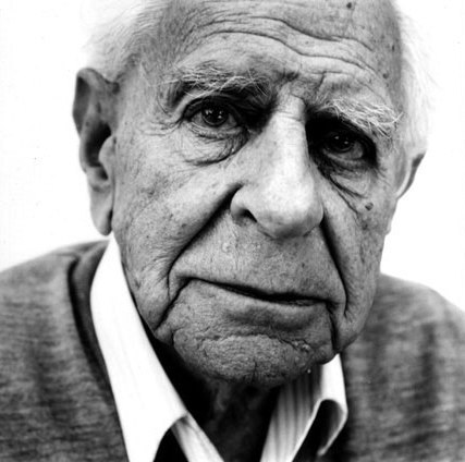
Your opinion of the people in the images completely change when you know that all of these men are philosophers. Knowing the profession or any kind of detail like this about an individual in a portrait, in my opinion makes the image more interesting to look at and has the viewer spending longer looking and thinking much more about the image.
A small detail i like about these above images is the slight reflection on the  glasses of these two men. Im not quite sure what it is thats made me pick up on this small and probably unintentional detail.

The incredible detail of all of steve pykes images for me is what makes them so interesting to look at. However the emphasis on this intense detail wouldnt be possible without the dramatic contrast of black and white, and his clever use of lighting. Steve Pyke infact alsmost always uses natural lighting.


I personally feel that this heavy contrast of black and white is better suited and more appealing to myself when the background is of a dark shade, rather than bright white. If i were to try and produce close up detailed portraits like this of my own i would use a dark backdrop.
I cannot image how difficult it must be only using natural light in these shoots as it means you have much less control over your shoot. Steve Pyke manages this very well.
I think the variation of angles he has the subject sat at and directions in which their looking is another successful aspect of his shoots, as he some how manages to make the photographs of people looking down or away from the camera just as striking as those photographs in which people are looking into the camera.
Through my own practice in the studio I've found it is difficult to capture a really striking and interesting image if there is no contact between the camera and the eyes of the subject.

Malick Sidibé


Malick Sidibé


After much research into the work of modern day photographers, capturing more high fashion images within the studio, for my next piece of research i have chosen to look back in time slightly. Malick Sidibé is a photographer who has documented a period in West African history mainly through capturing portraits. was awarded the Hassleblad award in 2003.

"In his portraits and documentary photography, he has uniquely captured the atmosphere and vitality of an African capital in a period of great effervescence."

http://www.hasselbladfoundation.org/malick-sidibe/

Although not all his images have been captured within a studio, it is interesting too still look at what the people are actually doing in the images. Documentary photography is probably something which appeals to me more than studio portraiture, as capturing natural behavoiur rather than telling a model or the subject what to do in an image is something which i find comes with greater ease. 
Documentary photography especially in the form of portraits could arguably be seen as the more interesting one for a viewer to look at as appose so a set up studio shoot, where the model is almost acting, in order to create exactly what the photographer wants. However a disadvantage with this kind of photography when creating portraits is there's very often a loss of strong eye contact with the camera, which is one element makes studio portraits so striking. 

Malik sidibe has captured a vast range of both studio photography and images in various other scenes, all of which, capture the west African culture of that time. 


Malick Sidibé


Obviously the images being in black and white were not intentionally changed to be like this. The photographer has used a black and white camera. I think this is a very striking and successful image, this makes me want to create black and white images for my final outcome. Although this image and many of the images i am going to present in this blog post are infact taken in Malick Sidibe's studio, the documentary style still comes through in the heavily patterned fabrics and clothes used in the images. He has not directed the shoot in any sense as in dress the subjects, these will have been their own clothes. This was the fashion of the time. 


Immagini 004


 - next picture


 - next picture


Malick Sidibé Man in Business-dress, like a pedestrian 1964


http://www.tumblr.com/search/malick+sidibe

with these two final images, it is interesting to note the shadows on the wall behind the subjects of the image. These shadows suggest a use of a flash or studio lighting.