Initial Ideas
Right from the very beginning of the project after creating my first few posts of research I felt i had a strong idea of what i was going to aim for in my studio portrait images.
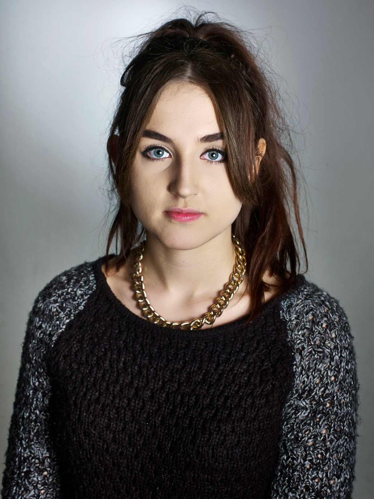
The photographs by other artists which really influence me most, were ones in which the models would be facing head on to the camera, with expressionless face and a strong connection between the eyes and the camera; very much like a passport photograph.
Especially seeing as though this module was named Introduction to studio I felt the simplicity of this style would be very suitable. I think this attraction to simple portrait images is very visible when looking through my blog and previous research posts.
This image by the photographer 'Lotusjosephine' was one of the first images I found in my research that really inspired me and stuck in my head as the direction I wanted my own photographs to follow in. Unlike a passport photograph the background is not white. When being shown the techniques of lighting to use in the studio, and how to set everything up, I found that the backgrounds were grey very much like this one. At this early point in the project I was unsure whether to keep the background colour this way or to have a white background. I experimented with both backgrounds and learnt how to create a bright white background.
After trying images with both backgrounds I found that the grey background looked far better. The grey colour linked well with the expressionless faces i was asking my models to preform.
Throughout the project although I had a strong concept of what I wanted my models to do in the photographs, and how I would intend to capture the images, I found myself constantly undecided on coloured images or black and white images right up until the editing of my final outcome. I had researched so many photographers who had captured stunning black and white photographs, which really did influence me. I decided to stick with colour as when finally editing my images I came to realise they just didn't really work in black and white. I think if I had experimented more with lighting techniques such as creating strong shadows on the faces of my models, a black and white effect could have worked well in adding to the dramatic feel of the image.
Final Outcome
I feel the research I've produced over this project shows direct links to what I was trying to aim and achieve in my own work. I think straight on shots such as these work well in contrast with the immense detail of the photograph. With expressionless faces the viewer is drawn to the eyes of the model. It can almost feel as though that person is actually stood before you and you are looking into their eyes.
A one to one with my tutor was extremely helpful in pointing out what I seemed to be drawn to in portraits, just from looking at my research. It became clear to me that strong eye contact was what drew me to particular portrait images. Although not all three images which I have produced as my final prints are straight on passport style portraits like what I said I wanted to aim for, all three do have this powerful contact between the models eyes and the camera.
when using capture one software to edit my images, i found that there was not much i wanted to do to improve the image in any way as i was not experimenting greatly with capturing the images in the studio. i wanted the images to be as simplistic as possible. i feel the simplistic way the portraits have been taken in actually create quite the opposite impression. the images in my opinion have quite a bold and dramatic feel to them.
In capture one the main adjustments i made were cropping, lessening some of the shadows, increasing the exposure, brightness, contrast and clarity. One other adjustment i made was creating a slight gradient around the edges of the images to enhance the backing light behind the models. - A dramatic example of this gradient in the background would be the image i have presented about by the photographer lotusjosephine.

The below image is the one i feel is most successful out of the final three i have chosen. Like discusessed in my post about studio lighting, getting the background light to be completely central behind the model was something which i felt worked incredibly well but wasnt always easy too achieve. In this image however, i have manedfed to achieve this. the lighting behind the back of the head almost creates a religious feel to the image.


No comments:
Post a Comment